Color of the year 2018
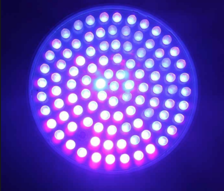
Color of the year 2018, ultra violet.
Why this color and how to use it ?
Colour experts at the Pantone Colour Institute pore over research and analyses of design, film, food, fashion, art and entertainment, as well as materials, travel, sports and technology, to arrive at a colour of the year. This year it’s ultra violet. Pantone colour number
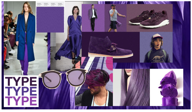
Ultra violet is a “provocative and thoughtful purple shade” that embodies individuality and spirituality. According to the company, it alludes to the mysteries of the cosmos and the unknown.
Each year, color experts at the Pantone Color Institute span all possible industries, design, film, fashion, food, art and entertainment, as well as research materials, the travel industry, sports and technology to ultimately arrive at a color that will define the gap for 2018 So this year: ultra violet
Why this color?
Ultra violet embodies individuality and spirituality. From dramatically challenging to balanced purples. Ultraviolet fits right in with this age of both imagination and inventiveness, of nostalgia (Prince’s Purple Rain) and new technology.
“The selection of Ultra Violet speaks to our shared desire for deeper understanding in an increasingly complex landscape, and our eagerness to experiment to reach that level,” said the company.
For more inspiration and beautiful examples read the article on WGSN
or the article from The Guardian.
this post also exists in Dutch
Send a Request for a
One-Page Review
(no-commitment)
Fill out this form to let me know you’re interested. I’ll answer to you within 48 hours and we can discuss the details.
